
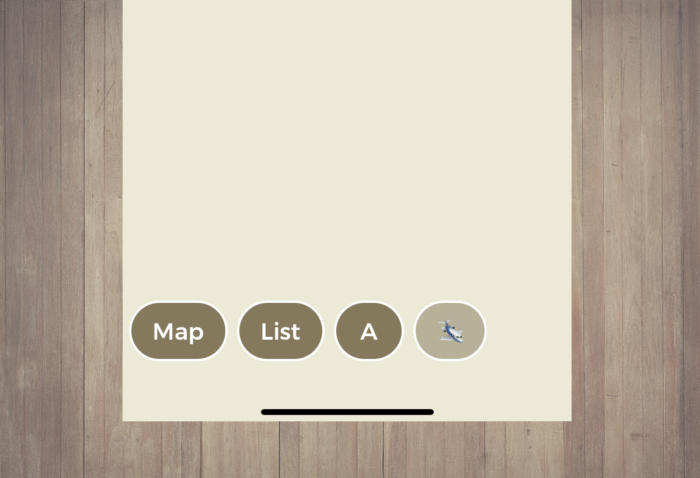
Does your Loquiz game have a map, a list, or playground(s)? Your game has buttons on the bottom of the screen. In today’s update, we made a few changes to the design of these buttons for a better player’s user experience.
The button’s width
Before, every button had a minimal width. You would get a lot of space between the characters of the button. With this update, it’s different: The width adapts to the player’s game even if there’s only one character (e.g. an emoji).
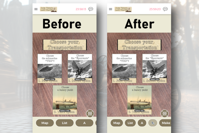
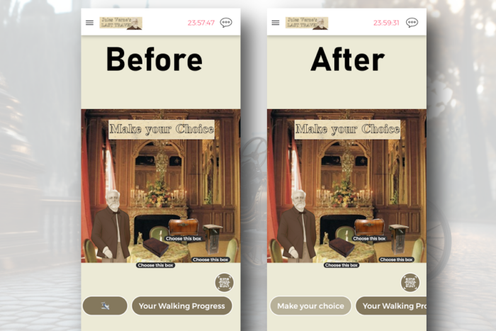
The button’s appearance on click
Before, when you opened a playground/map/list, the button would just disappear. After the update, the button remains, but with a different color. In terms of user experience, it allows the player to know where they are immediately. That’s more user-friendly when you have quite a lot of choice of playgrounds: The player can indeed know which part of the Loquiz game they are.
Your feedback
If you have any feedback on this change, feel free to send me an email. Besides, we will have some other upcoming changes soon, so stay tuned!
Related stories
A good outdoor game (such as a scavenger hunt) takes place in a nice location. And sometimes, some areas don’t...
You’re playing a photo game (like the Photo Hunt); players take a lot of fun photos. But you’d like players...
You’re about to start an outdoor Loquiz game, and there will be a lot of players. How to avoid them...
Start free trial to bring your ideas to life
Sign up and create games, tours, team events and educational content that captures peoples' attention
Start from the scratch or use templates to kickstart!
